Loading Table of Contents...
What is a website footer? Structure and standard examples
What is a website footer? Learn its role and design principles, plus beautiful website footer UI examples and templates for better user experience.
A website footer is the content area located at the bottom of a web page. It provides contact information, supports user navigation, and strengthens brand credibility. This article examines the recommended structure, common design mistakes, and practical footer examples in detail. Understanding these fundamentals can help you retain customers more effectively while improving how search engines discover and crawl your website.
What is a website footer? Its role in the user experience
A website footer is the area located at the very bottom of an interface and generally appears consistently across the website’s pages. When visitors reach the end of a page without finding the information they need in the main content, the webpage footer can act as a final point of assistance.
The navigation system in this area provides additional internal links, allowing customers to quickly move to important categories instead of immediately leaving the website. According to various studies of user behavior, bounce rates can decrease when visitors are given additional options to continue interacting with a website.
More importantly, a clear information structure can strengthen brand trust. Customers feel more confident when they can easily find contact details, business licenses, or privacy policies. From a search engine perspective, a static HTML5 structure can also help crawlers navigate the website more easily and support more comprehensive indexing of the overall system.
Required and optional elements in a website footer
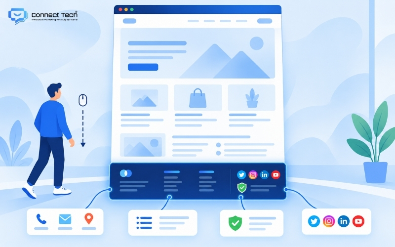
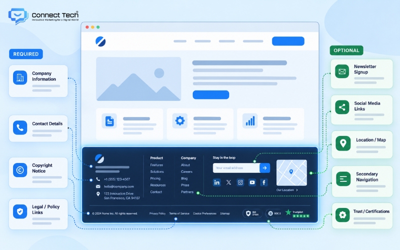
To avoid arranging information according to a rigid formula, designers should clearly separate footer content into two main groups. The first group includes elements required for brand identification and legal purposes. Businesses should publicly provide specific contact information following the standard NAP structure: name, address, and phone number. Copyright information, together with links to the privacy policy and terms of use, also helps protect the legal rights of both the business and its users.
In the Vietnamese market in particular, some of the following elements may be required to demonstrate transparency:
- Company name, physical address, phone number, and support email.
- Certification logo showing that the website has been notified to or registered with the Ministry of Industry and Trade.
- Digital copyright protection badge such as DMCA, if applicable.
The second group includes optional components intended to improve user experience. Social media icons provide additional communication channels, while newsletter subscription forms support lead generation. Adding Google Maps directions or a secondary navigation menu can also help customers identify a business location and find information more quickly within the site footer.
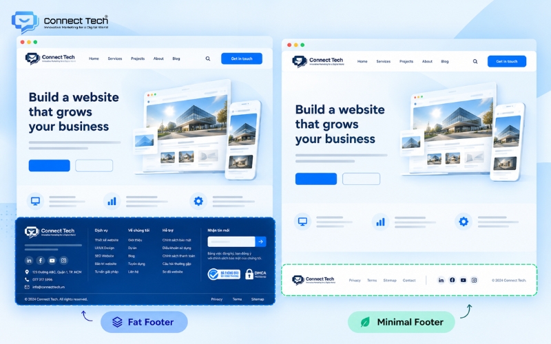
The difference between a fat footer and a minimal footer in website structure
In modern web design, a fat footer refers to an extended footer structure containing a large amount of information, usually divided into four or five columns. This layout may include complete product categories, links to featured articles, support information, and store directories. Because it can accommodate a substantial amount of content, this structure is particularly suitable for e-commerce platforms, online publications, or B2B businesses with diverse service ecosystems.
In contrast, a minimal footer removes most secondary navigation links and focuses only on essential information. This style generally retains the logo, copyright information, and a few basic social media links. Personal websites, portfolios, and event landing pages often use this approach to keep the overall interface clean and refined.
Businesses should base their website footer design decisions on the behavior of their target audience so that the structure remains logical and delivers the strongest possible conversion value.
Principles for standard and technically optimized footer design
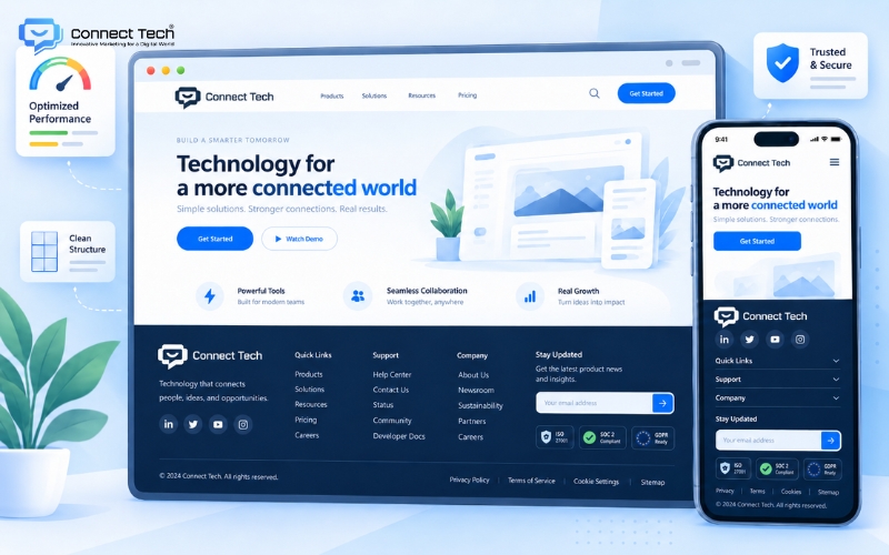
From a visual perspective, there should be clear color contrast between the footer area and the content above it. A dark background with light text, or the reverse, can help visitors clearly distinguish between different information areas.
Choosing a website footer with a clear visual hierarchy prevents users from feeling overwhelmed when viewing many links at once. Responsive display on mobile devices is also essential. When the interface switches to a smartphone layout, the system should meet the following standards:
- Horizontally arranged information columns should switch to a vertical stacked layout.
- Font sizes should be large enough for users to read comfortably and interact easily on smaller touchscreens.
- Line height should be adjusted carefully to reduce the risk of users tapping the wrong link.
From a technical perspective, developers should limit the file sizes of footer images such as logos and certification badges. Oversized images can slow page loading speed, negatively affecting both browsing experience and crawl budget.
Finally, microcopy used for buttons and links should remain concise, intuitive, and action-oriented.
Website footer design examples by industry
Below is a detailed analysis of several information layouts designed to match customer search behavior in different industries.
Footer example for the real estate industry
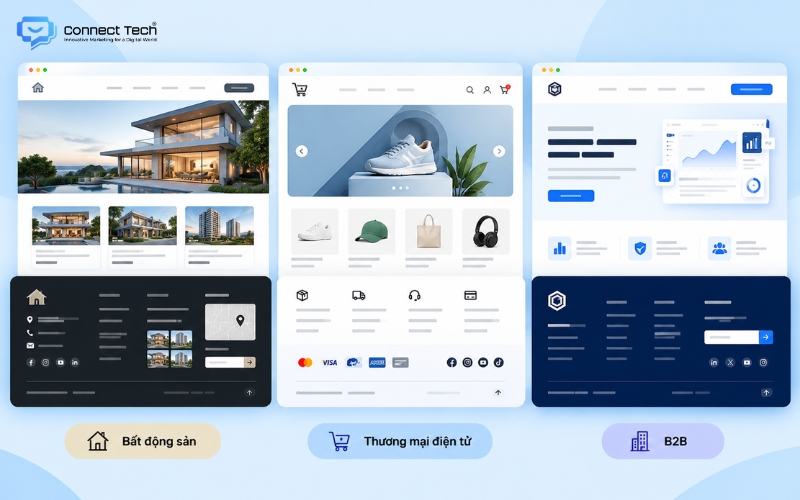
For real estate websites, footer layouts often prioritize placing a consultation form directly at the bottom of the page together with a visual map so customers can easily understand the project location. This structure encourages potential investors to leave their contact information immediately after they finish reading the main project content above.
Footer design for e-commerce websites
In e-commerce, website footer templates usually emphasize purchasing policies, return and exchange conditions, and a list of trusted payment gateways. Logos such as Visa, MasterCard, or VNPay can be arranged clearly to reinforce the security of the transaction platform. In addition, integrating icons for available shipping methods can make customers feel more confident before completing payment.
Footer layout for B2B businesses
B2B service businesses such as technology or software companies, in contrast, often prefer a more streamlined design. They typically guide users toward a company profile, downloadable industry documents, or direct contact with specialist consultants. Applying these layouts flexibly demonstrates the practical capabilities of development providers and helps them address clients’ business requirements more effectively.
Common mistakes to avoid when implementing a footer
One of the most common mistakes is inserting too many keywords into footer links in an attempt to manipulate search rankings. Keyword stuffing not only makes the interface visually cluttered but can also cause Google’s algorithms to evaluate the page less favorably because it does not follow natural optimization practices. Customers can also become frustrated when faced with dense blocks of keywords that provide no meaningful information.
Typography problems are also common when businesses use fonts that are too small or text colors that blend into the background. Visitors may be unable to read contact details or important policies, which can reduce their perception of the brand’s professionalism.
In addition, omitting required legal links or leaving broken links in the website footer can directly reduce customer trust. The technical team should continuously review the internal linking system to ensure that browsing remains seamless and secure while supporting the most effective flow of trust throughout the website.
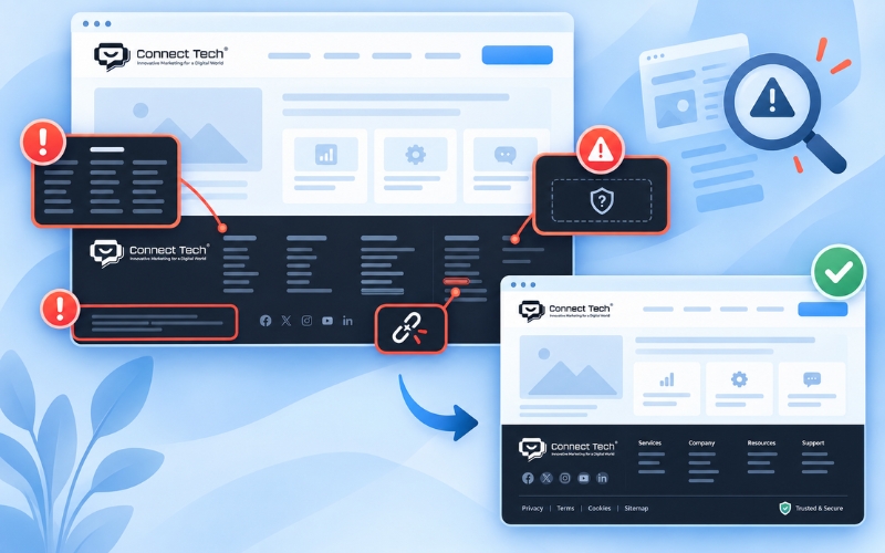
In summary, building and optimizing a website footer requires a clear understanding of both user behavior and strict technical principles. When developed properly, this area can become an effective tool for improving conversion rates and strengthening a brand’s long-term position across digital channels.
If you are looking for a partner to build an SEO-friendly website that is optimized for conversions and easy to scale in the future, contact Connect Tech to receive the most suitable technology solution.
Connect Tech provides custom website design solutions that combine technology, SEO, and Digital Marketing so websites can grow alongside the business. Contact Connect Tech for advice on a solution that fits your business model and objectives.
Connect Tech - Web Design Agency
Innovative Marketing for a Digital World
Hotline: 077 317 5996
Email: info@connecttech.vn
Table of Contents
Related news
What is visual design? A foundation for better conversions
What is visual design? Learn the role of a visual designer and design and visualization fundamentals for better UX/UI and website conversions.
Standard website banner sizes for every screen
Learn standard website banner sizes for every device, plus safe zone rules, image optimization tips, and a technical SEO checklist.
Website header: Design standards for better UX and SEO
What is a website header? Explore its structure, standard dimensions, and design examples that improve UX, conversions, and customer retention.
What is a website footer? Structure and standard examples
What is a website footer? Learn its role and design principles, plus beautiful website footer UI examples and templates for better user experience.
Top 15 web design fonts for SEO and better UX/UI
Explore the best web design fonts for 2026. Learn how to choose commonly used fonts that improve UX/UI and support Vietnamese characters correctly.
What is a wireframe? Wireframe vs mockup explained
What is a wireframe? Learn the difference between wireframes and mockups and why structural sketches help businesses improve user experience.