Loading Table of Contents...
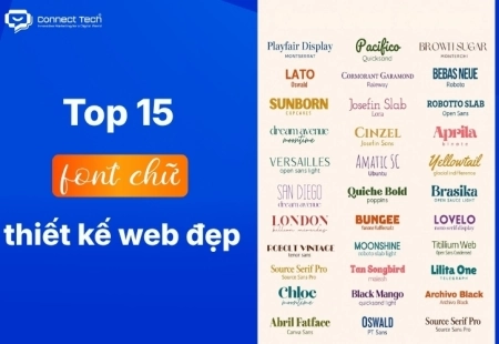
Top 15 web design fonts for SEO and better UX/UI
Explore the best web design fonts for 2026. Learn how to choose commonly used fonts that improve UX/UI and support Vietnamese characters correctly.
Choosing the right web design fonts is a fundamental technical factor that directly affects readability and conversion rates on digital platforms. No matter how attractive an interface looks, it will fail if the content is difficult to read. This article compiles UI/UX-friendly fonts with Vietnamese language support and explains the technical standards that can help strengthen your brand identity.
The importance of typography: How do web design fonts affect conversion rates?
Fonts do more than solve visual design problems. They also act as a cognitive navigation tool that directly influences user behavior and purchasing decisions in digital environments.
Impact on UX (User Experience)
A well-structured typography system reduces cognitive load for readers. Clear characters, appropriate line spacing, and a well-defined information hierarchy allow users to process content more smoothly. The easier customers can consume information, the longer their time on page tends to be, while the bounce rate can also decrease.
Defining brand personality (brand voice)
The visual form of characters acts as the brand’s “unspoken language.” Rounded letterforms create a friendly and approachable impression, making them suitable for consumer-oriented industries. In contrast, geometric and structured Sans-serif typefaces communicate sharpness, modernity, and expertise, which often suit technology or financial companies.
Direct impact on conversion rates
Text presentation directly affects the performance of critical touchpoints. If a call-to-action button, lead form, or pricing table uses an overly decorative font, excessively thin strokes, or text that is too small, users may find it difficult to interact with the interface. This visual friction can directly reduce click-through activity and interrupt the buyer journey.
Top 15 commonly used web design fonts by industry
Choosing a typeface that matches the characteristics of an industry helps businesses establish trust from the very first impression.
B2B / Technology / Service websites
B2B companies and service providers require interfaces that communicate clarity, logic, and reliability. These websites often prioritize strong Sans-serif typefaces that remain sharp and readable on high-resolution desktop and mobile screens.
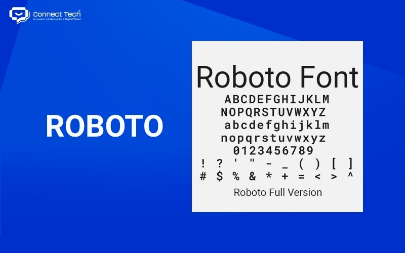
1. Roboto
Google developed Roboto as a balance between a strong geometric structure and softer, more approachable curves. This widely used typeface makes excellent use of display space, helping data tables on management dashboards appear cleaner and easier to read.
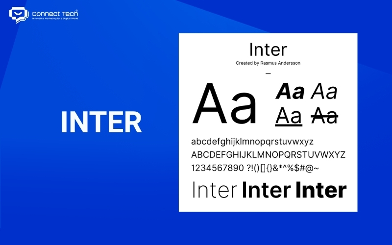
2. Inter
Rasmus Andersson designed Inter specifically for computer interfaces. Its large x-height helps small text remain clear on Software-as-a-Service platforms, minimizing jagged character rendering as much as possible.
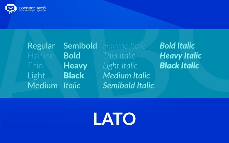
3. Lato
Łukasz Dziedzic created Lato to balance the seriousness of a corporate environment with a warmer, more human feel. Its semi-rounded details help B2B websites feel less rigid and formal.
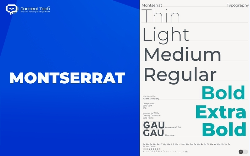
4. Montserrat
Inspired by urban signage, Montserrat has a distinctly modern geometric style. Its wide letterforms and generous tracking make it a popular choice for large hero headings on technology agency homepages.
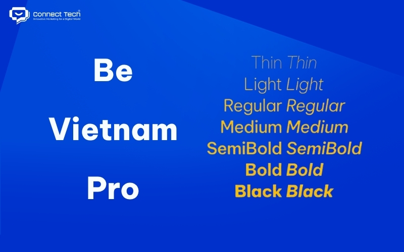
5. Be Vietnam Pro
A Vietnamese design team developed this typeface to address the complex diacritic requirements of the Vietnamese language. Its careful optimization of tone marks, including hỏi, ngã, and nặng, makes Be Vietnam Pro a strong choice for websites serving large domestic Vietnamese brands.
E-commerce websites
E-commerce platforms handle large volumes of information, including product names, technical specifications, and pricing. Fonts used in these environments need maximum clarity so customers can skim content without confusion.
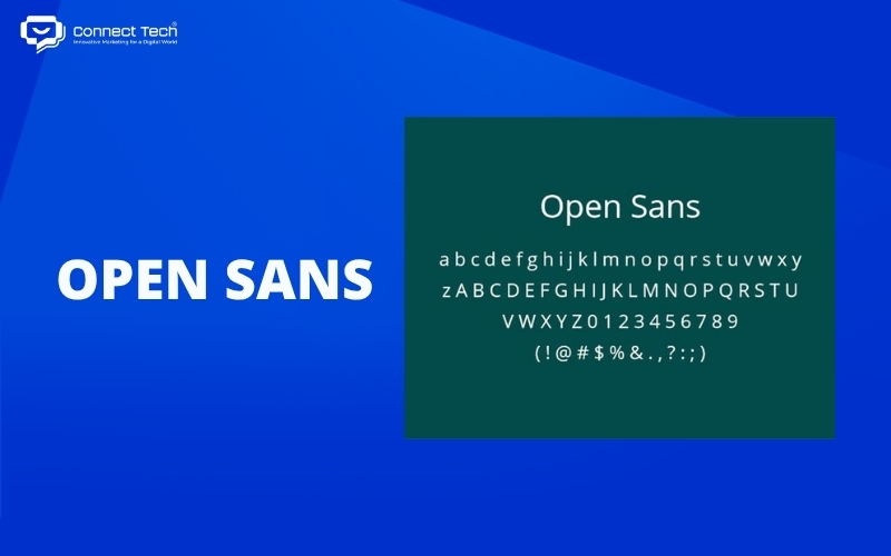
1. Open Sans
Steve Matteson optimized Open Sans for digital display performance, particularly on smaller screens. The clarity of its numerals reduces the risk of customers misreading prices, which can help lower cart abandonment rates.
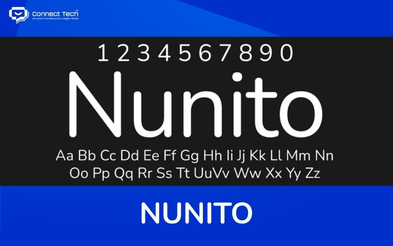
2. Nunito
Vernon Adams designed Nunito with soft, rounded terminals. This visual characteristic creates a calmer, more comfortable, and more trustworthy online shopping experience.
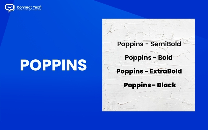
3. Poppins
Poppins breaks away from conventional rounded fonts by using precise geometric proportions to create a modern and clean appearance. Many cosmetics and high-tech retail websites use Poppins to create a contemporary visual style.
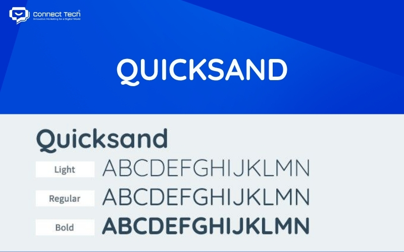
4. Quicksand
The light and refined structure of Quicksand makes it particularly suitable for industries that require a softer visual identity, such as organic consumer products, mother-and-baby brands, or sustainable fashion.
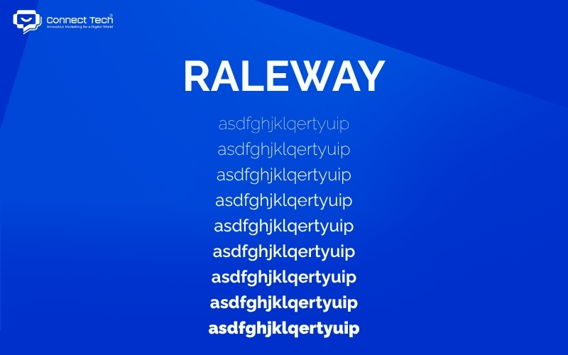
5. Raleway
Raleway began as a typeface with only a thin weight but has since developed into a diverse font family. It is particularly useful for complex navigation systems such as mega menus because its elegant appearance does not overpower product imagery.
Fashion / F&B / Creative websites
Luxury brands, fashion magazines, and premium restaurants need to evoke emotion. Using beautiful and sophisticated typefaces, usually Serif fonts or expressive handwritten styles, can create a more artistic visual experience.
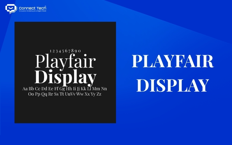
1. Playfair Display
Claus Eggers Sørensen drew inspiration from a transitional period in printing history when creating Playfair. Its high contrast between thick and thin strokes makes Playfair Display especially effective for large H1 headings on fashion campaign landing pages.
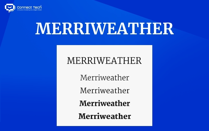
2. Merriweather
Merriweather was designed specifically for on-screen reading. Its broad letterforms and consistent character height allow users to read long-form beauty articles or brand storytelling content more comfortably without excessive eye strain.
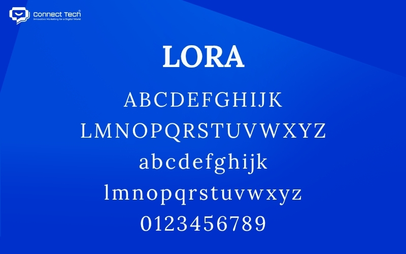
3. Lora
Lora carries the flowing rhythm of contemporary calligraphy. Fine-dining restaurant websites often use Lora for menus to create a refined and elegant impression for diners.
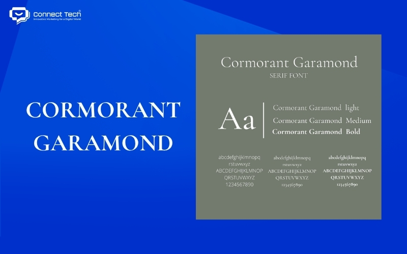
4. Cormorant Garamond
Building on the heritage of classic Garamond styles, Cormorant brings a sophisticated and premium feel to websites. Jewelry brands and luxury resort real estate businesses often use this typeface to reinforce the high-end value of their products.
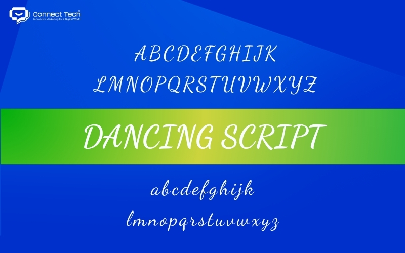
5. Dancing Script
Dancing Script recreates the natural and spontaneous feel of handwriting, breaking the rigidity of digital text blocks. It is often used as a decorative accent for quotes or signatures, adding softness and elegance to the overall interface.
“Golden rules” for choosing beautiful fonts for web design
Using fonts randomly in web design without considering the technical foundation can disrupt the interface structure, cause display errors, and slow page loading speed. To maintain system performance and user experience, several technical principles should be followed.
Choose fonts that display Vietnamese diacritics correctly
Incorrect diacritic rendering, such as ă, â, ê, ơ, or ư appearing at the wrong size or in a different style from unaccented characters, is a serious UI problem. A standard Unicode character set does not necessarily guarantee full support for the Vietnamese character extension.
Before finalizing a typography system, visit Google Fonts or Adobe Fonts. In the “Custom Preview” section, enter a sentence containing Vietnamese letters with circumflexes and tone marks such as sắc, huyền, nặng, hỏi, and ngã.
For example: Việc lựa chọn kỹ lưỡng giải pháp hỗ trợ chuyển đổi số mang lại hiệu quả vững chắc.
If all tone marks appear in the correct positions without touching the letters or becoming distorted, the typeface is suitable for Frontend development.
Page Speed: Web-safe fonts vs Web fonts
Page loading performance is a core Technical SEO factor and directly affects Google’s LCP, or Largest Contentful Paint. Browsers need to send requests to download Web font files from external hosting servers to the user’s device, which consumes both time and bandwidth.
|
|
|
|
|
|
|
|
|
|
|
|
Technical solution
Developers can apply the CSS property font-display: swap when embedding Web fonts. This property instructs the browser to display content immediately using a Web-safe fallback font and then automatically switch to the intended Web font once the file has finished loading. This prevents the reading experience from being interrupted regardless of which font the website uses.
The art of font pairing between headings and body text
Contrast creates an engaging visual rhythm and naturally guides the reader’s eyes from main headings to supporting details. Typography pairing is a subtle skill that requires an understanding of the geometric structure of letterforms.
Contrast rule (Serif + Sans-serif): Combine a classic and elegant Serif font for headings, such as Playfair Display, with a modern and clear Sans-serif font for body text, such as Lato. This contrast creates a clear visual hierarchy.
Superfamily rule: Use different variations within the same typeface family. In simple terms, choose fonts with similar characteristics, such as using a heavier weight for headings and a regular or light weight for body text.
For example, use Roboto Bold for headings and Roboto Regular for body text. This method maintains strong visual consistency while preserving clear content hierarchy.
Limit the number of fonts
Avoid embedding and using more than three different font families within a single website project. Using too many typography styles not only increases page load size and can reduce SEO performance, but also makes the interface appear inconsistent and unprofessional.
An effective typography system should use no more than three fonts: one for headings to attract attention, one for body text to maintain readability, and one optional accent font for decorative emphasis.
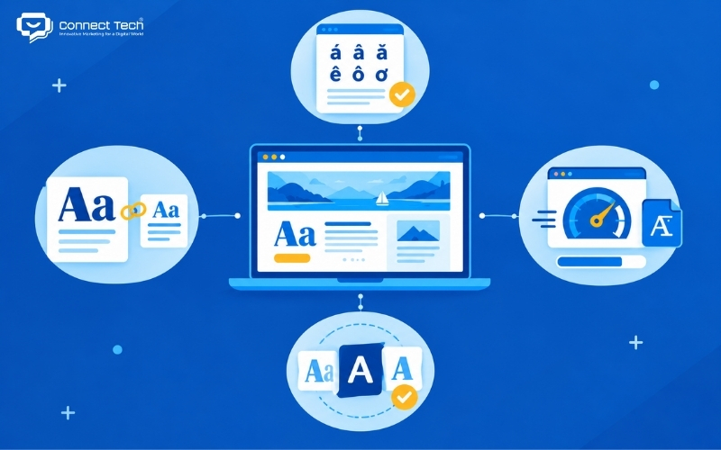
Choosing and configuring web design fonts is not simply a matter of personal preference or subjective taste. It is a strategic decision that connects interface design, user experience, and technical performance. A well-structured typography system can become a strong foundation for building trust and improving conversion rates across digital platforms.
Connect Tech provides custom website design solutions that combine technology, SEO, and Digital Marketing so websites can grow alongside the business. Contact Connect Tech for advice on a solution that matches your business model and objectives
Connect Tech - Web Design Agency
Innovative Marketing for a Digital World
Hotline: 077 317 5996
Email: info@connecttech.vn
Table of Contents
Related news
Top 15 web design fonts for SEO and better UX/UI
Explore the best web design fonts for 2026. Learn how to choose commonly used fonts that improve UX/UI and support Vietnamese characters correctly.
What is a wireframe? Wireframe vs mockup explained
What is a wireframe? Learn the difference between wireframes and mockups and why structural sketches help businesses improve user experience.
What is usability? How to optimize it for more conversions
What is usability? Explore 5 core usability factors, usability testing, and mobile usability optimization to help business websites increase conversions.
Interior website design services optimized for conversions
Connect Tech provides premium SEO-friendly interior website design with optimized UI/UX and page speed to improve customer conversion rates.
Professional cosmetics website design to grow revenue
SEO-friendly cosmetics website design with optimized UX/UI to own customer data, build trust, and grow revenue. Get expert advice today!
What you need to know when designing a website professionally
What you need to know when designing a website: goals, UX/UI, SEO, speed, security, technology, and effective long-term operations.