Loading Table of Contents...
Standard Website Font Size: Optimizing UI/UX and Increasing Conversion Rates
Learn about standard website font sizes to optimize the reading experience, improve mobile friendliness, and increase conversion rates for businesses. See now!
The standard website font size currently ranges from 16px to 18px for main content to ensure optimal readability. This article will analyze detailed typography standards across desktop and mobile devices, while providing foundational guidance on configuring font sizes to optimize UX and satisfy SEO algorithms.
The importance of standard website font sizes in design and seo
The decision behind font size selection directly impacts how users interact with content and how search engines evaluate website quality.
Typography does not merely serve a decorative function within the display interface. A reasonably scaled font set operates as an intelligent navigational tool. This element helps readers easily absorb large volumes of information without feeling overwhelmed or confused.
From a User Experience (UX) perspective, optimizing standard website font sizes allows customers to scan information quickly and minimizes eye strain. This is particularly crucial for B2B audiences or purchasing decision-makers, as they frequently study lengthy technical documents. When users feel comfortable during their information intake, the time on site increases significantly.
From a Search Engine Optimization (SEO) perspective, standard text sizes help webmasters avoid the "Text too small to read" warning on Google Search Console. Google consistently prioritizes indexing and ranking websites that provide a mobile-friendly reading experience.
Ultimately, a website with clear content directly supports business strategy. A seamless experience reduces the bounce rate, thereby accelerating the conversion process from website traffic to qualified leads.
Standard website font sizes for desktop interfaces
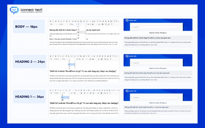
Desktop interfaces offer expansive display areas; therefore, developers must distribute the typography system according to a clear visual information hierarchy. Currently, the 16px to 18px range is considered the standard size to guarantee reading comfort on computer monitors. If you utilize smaller sizes, the text block will appear cramped and diminish the interface's user-friendliness.
For the heading system, you need to create size contrast to direct the viewer's eye-flow. Clear headings help readers grasp the article's structure within a few seconds of skimming. You can reference the following standard size distribution guide:
- H1 Heading (Article or Homepage Title): Sizes typically range from 32px to 40px, or larger depending on specific design styles. A large size helps the H1 heading create a strong visual impact and highlight the core topic.
- H2 and H3 Headings (Subheadings): The ideal size falls between 20px and 28px. This heading group creates a logical hierarchy, breaking the article down into easily digestible content segments.
- Auxiliary Elements (Small text): Information such as image captions, copyright notices, or footer content requires smaller text formatting. You should maintain a size between 12px and 14px for this supplementary content.
To maintain usability, designers must strictly adhere to minimum size limits.
|
Note: Absolutely do not set font sizes below 12px on any device. Such an excessively small display will break the reading experience and prevent users from receiving your business message. |
Standard website font sizes for mobile devices
Mobile screens demand a distinct display optimization strategy to accommodate users' continuous scrolling habits.
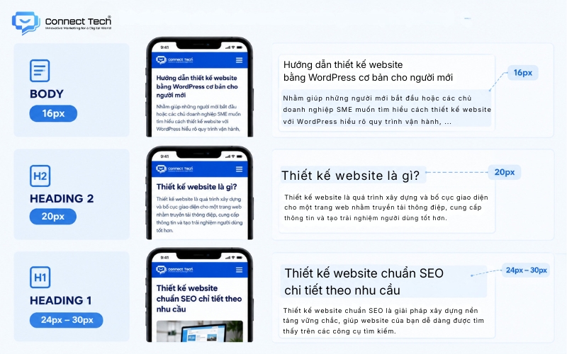
Mobile traffic currently accounts for over 60% of total global web traffic. Google applies the Mobile-first Indexing algorithm, prioritizing the indexing of the mobile versions of websites. Consequently, standard website font sizes on small screens directly dictate a business's search ranking.
Body text on mobile phones must absolutely be maintained at a minimum of 16px. If you set a smaller size, users will be forced to zoom in on the screen to read the information. This redundant action causes an incredibly inconvenient browsing experience and increases the bounce rate.
The heading system on mobile devices needs to be scaled down compared to the desktop version. For instance, the H1 tag should be capped at 24px to 30px so it does not consume excessive display space. Controlling this ratio helps the overall interface remain balanced and airy.
To ensure display quality across multiple devices, interface developers do not configure settings individually for each device. The optimal approach is responsive typography. This method establishes flexible CSS values, allowing the system to automatically adjust text sizes based on the actual screen dimensions.
Accompanying elements to optimize conversion rates
Text size only maximizes its effectiveness when synchronized with other digital formatting parameters. Several elements require attention alongside font size:
|
|
|
|
|
|
|
|
|
|
|
|
|
|
|
|
|
|
|
|
Signs your business website has incorrect font sizes
Early identification of text formatting errors helps administrators promptly rectify interface issues and salvage conversion rates.
First, the bounce rate indicates the level of user satisfaction upon visiting the website. A digital platform utilizing an excessively small typography system frequently records abnormally high bounce rates, particularly on mobile devices. Customers will leave immediately if they must continuously zoom in and out to read product information.
Second, the Google Search Console system acts as a technical supervisor for the website. This platform regularly scans and sends automated email alerts regarding mobile usability errors. When the system flags the "Text too small to read" error, Google is directly signaling that the article's SEO ranking faces a severe risk of dropping.
Finally, negative user feedback provides the most tangible evidence of poor UI/UX. Readers frequently complain about text blending together into a dense block (wall of text). An outdated interface hinders customers from finding information and degrades the brand's credibility in the eyes of partners.

Solutions for optimizing ui/ux and comprehensive website systems
Web developers possess numerous agile technical methods to refine the typography system and comprehensively upgrade the user interface.
The Inspect tool (F12 shortcut) on web browsers assists programmers in rapidly checking design parameters. You can view the exact text sizes and line heights currently applied to individual HTML elements. This highly functional feature allows SEO specialists to immediately detect CSS codes causing display errors and request modifications.
Relative measurement units offer maximum customization capabilities for modern web design. Programming experts recommend that coders adhere to the following core CSS principles:
- Utilize rem and em units: Programmers should use proportional units (rem, em) instead of absolute units (px). The rem unit calculates size based on the root element, enabling the entire text system to scale synchronously across diverse devices.
- Establish CSS Variables: A global variable declaration system helps designers centrally manage all typography parameters. Altering a single root variable will instantly update font sizes across thousands of pages.
- Apply Media Queries: This technique instructs the browser to apply different formatting rule sets based on screen width. Mobile screens will automatically receive a distinct set of size standards compared to desktop monitors.
Testing processes in real-world environments play a decisive role in the quality of published products. Administrators must always load the website on various physical screen sizes (smartphones, tablets, desktop monitors) to directly evaluate the reading experience, thereby ensuring flawless content display that maximally supports the effectiveness of communication campaigns.

In summary, establishing standard website font sizes acts as a solid foundation in the journey of building a professional digital platform. This element, combined with intelligent interface architecture, will create a smooth and seamless interactive environment. A user-friendly website not only retains readers longer but also silently prompts them to execute valuable conversion actions.
—----------------------------
Connect Tech provides custom website design solutions, integrating technology, SEO, and Digital Marketing to ensure your website scales alongside your business. Contact Connect Tech to consult on tailored solutions that align with your business model and objectives.
Connect Tech - Web Design Agency
Innovative Marketing for a Digital World
Hotline: 077 317 5996
Email: info@connecttech.vn
Table of Contents
Related news

Top tools to check website speed and optimize effectively
Learn how to check website speed with accurate tools, analyze what slows your site down, and optimize website load speed to increase conversions.

How to Design a Landing Page with Free Tools
Learn how to design a landing page with LadiPage, Canva, WordPress, Wix, Google Sites, Mobio, SITE123, and GetResponse, from start to finish.

Top 8 AI Website Design Tools and How to Use Them
Explore eight AI website design tools, including Wix, Figma, Hostinger, and TeleportHQ, and learn how to create, edit, and optimize your website for SEO.

How to Design a Website with Google Sites: A Beginner's Guide
Learn how to build a Google Sites website from start to finish: create pages and menus, design the layout, add content, integrate Google tools, connect a custom domain, and publish.

How to Design a Website with Canva in 5 Easy Steps
Learn how to design a website with Canva, from choosing a template and editing the layout to basic SEO, connecting a domain, and publishing your site.

What is a responsive website? How to test & optimize for conversions
What is a responsive website? A guide on how to test display performance and responsive website design solutions to help increase conversion rates and save ads budget effectively.