Loading Table of Contents...
How Website Colors Influence User Emotions
How website colors shape user emotions, trust, and conversion. Learn common mistakes, color psychology, and how to choose colors that drive action growth now
Website color is not merely an aesthetic element. It is the first emotional signal users receive when they land on a website. In those brief few seconds, website colors quietly shape feelings of trust, interest, or doubt, even before users read a single line of content.
In reality, many websites offer good products and clear information, yet still perform poorly. The reason often lies in website colors that do not align with user psychology or business objectives. Choose the wrong colors, and emotions are misdirected. When emotions are misaligned, behavior changes. Users leave without needing a clear reason.
This article goes straight to the core. It examines how website colors influence user emotions, how they affect behavior and conversion, and why many businesses continue to make very basic mistakes when choosing colors. No rambling theory. Just practical perspectives that help you rethink website color with a more strategic mindset.
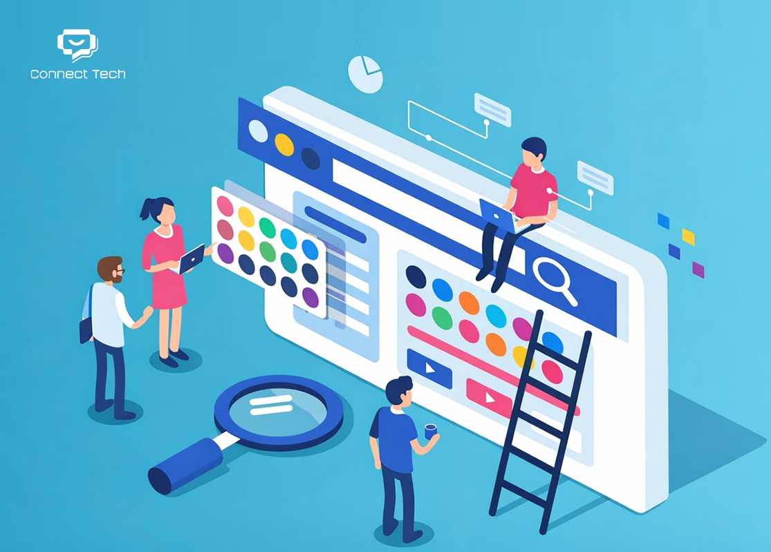
I. How Website Colors Influence User Emotions
Website colors affect user emotions through three distinct layers. Without looking at them through this structure, analysis easily becomes vague and superficial.
1. Immediate Emotional Reaction in the First 3–5 Seconds
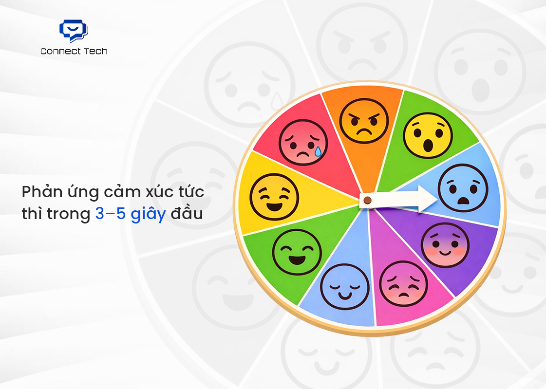
Users do not read a website immediately. They feel it first. Website color is the first signal the brain processes to decide whether to stay or leave.
- Dark, muted colors with low contrast often create a sense of heaviness and slowness, requiring more mental effort to focus.
- Bright colors with clear contrast help the brain process the interface faster, creating a feeling of lightness and accessibility.
At this stage, website color does not need to be beautiful. It needs to be cognitively comfortable. If it causes visual strain, negative emotions appear instantly, even before users understand what the content is about.
2. Website Colors Shape Emotional Perception of the Brand
After the initial reaction, website colors begin to work at a deeper level. They link the website to a specific emotional state in the user’s mind.
- Consistent website colors create a sense of professionalism and intention.
- Random, impulsive color use makes the brand feel unfocused and directionless.
This emotion is rarely verbalized, but it directly determines trust. When website colors do not match the industry or the message, users sense that “something is off,” even if they cannot clearly explain why.
3. Visual Emotion Directly Affects Information Processing
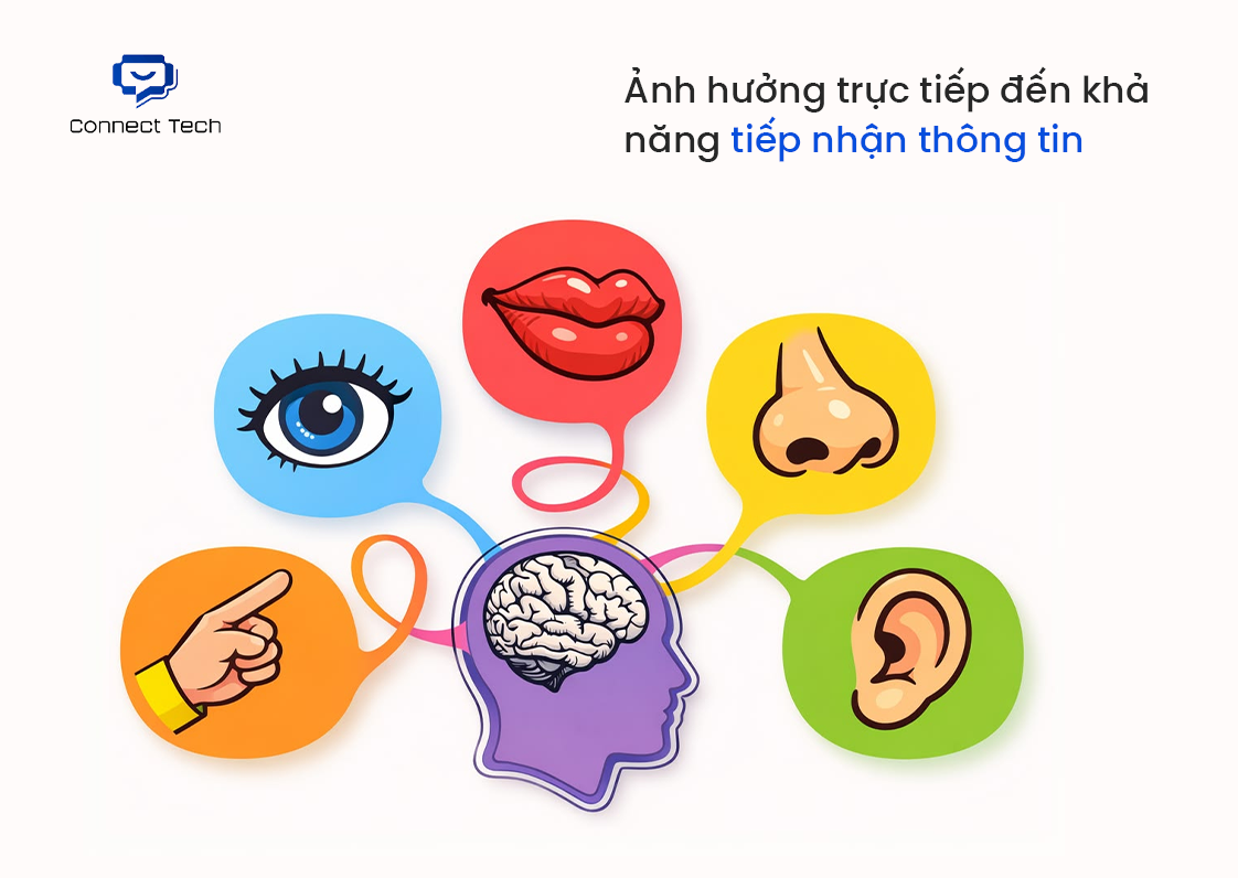
Emotion is not just a feeling. It influences how users process information.
- Poor background and text color combinations cause eye fatigue quickly.
- Misplaced accent colors leave users unsure of what matters most.
- Too many strong colors force the brain to constantly adapt, leading to exhaustion.
When emotional energy is consumed just by looking, users no longer have the capacity to make decisions. At that point, the issue is not content or CTA, but website color.
Website color is the emotional foundation of web design. When colors are chosen correctly, the website becomes easier to understand, easier to trust, and easier to interact with. When chosen incorrectly, every optimization that follows is neutralized at the very first touchpoint.
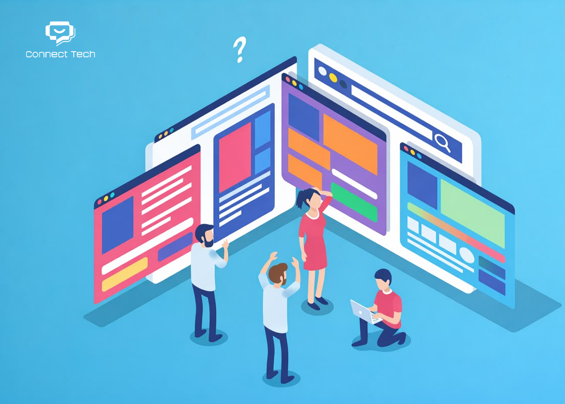
II. The Emotional Meaning of Common Color Groups on Websites
Website colors do not carry emotional meaning at random. They trigger psychological associations that already exist in users’ minds. Understanding common color groups allows you to manage emotion deliberately, rather than choosing colors based on instinct.
1. Warm Color Group
Red, orange, yellow.
This group conveys high energy, stimulation, and strong visual attention. On websites, warm colors tend to attract the eye very quickly.
- Red creates a sense of urgency and power, and can sometimes feel pressuring.
- Orange feels friendlier and more approachable than red.
- Yellow suggests optimism, but can easily cause eye strain if overused.
Website colors in this group work best as accents, CTAs, or important notifications. When used as dominant colors, they can make users feel tense and reduce the ability to sustain focus over time.
2. Cool Color Group
Blue, green, purple.
Cool colors create a sense of stability, safety, and visual comfort. This group appears most frequently on service and technology websites.
- Blue conveys trust, logic, and professionalism.
- Green is associated with balance, nature, and health.
- Purple evokes creativity and a premium feel, but is difficult to use broadly.
Website colors in this group help users feel more comfortable when reading information and making decisions. However, overusing cool colors can make a website feel emotionally distant or cold if there is no well-placed accent color.
3. Neutral Color Group
White, black, gray, beige.
This group forms the emotional base for all other colors. In practice, effective website color systems rely heavily on neutral tones.
- White creates a sense of openness, clarity, and modernity.
- Black suggests strength, sophistication, and control.
- Gray conveys balance, restraint, and a technical feel.
Neutral colors reduce emotional noise and improve readability. When overused, however, a website can become flat and forgettable.
4. Website Colors and Industry Context
The emotional meaning of website colors does not exist in a vacuum. The same color can create different emotional responses depending on the industry.
- Red in the food industry feels completely different from red in finance.
- Green in wellness feels positive, but in fintech it may create mismatched expectations.
There is no color that is “right for every website.” There are only colors that align with business goals, industry context, and the emotional journey a website intends to guide users through.
IV. Common Mistakes When Choosing Website Colors
Most website color mistakes do not come from a lack of tools or technical knowledge. They come from flawed thinking at the very beginning of the color selection process. Below are recurring errors seen on many websites, including those with significant investment.
1. Choosing Colors Based on Personal Preference
This is the most common mistake. Website colors are decided by the taste of the decision maker, not by the emotions of the target users.
Liking bold colors, vibrant tones, or something that feels different is personal. But users do not stay because of the website owner’s preferences. When website colors reflect ego instead of user behavior, the experience is misaligned from the start.
2. Using Too Many Colors on a Single Website
Many websites try to “say too much” through color. The result is that no color truly leads. Too many strong colors scatter user emotion. The eyes are forced to constantly adapt. The brain becomes tired before it has time to understand the content. In this situation, website color turns into noise rather than a guiding tool.
3. Lacking a Clear Color System
Website colors are used impulsively. One page looks one way, another looks different. CTAs appear in different colors across the site.
Without a color system, user emotions become unstable. The website loses its sense of professionalism. Even with strong content, users still feel a lack of trust because everything appears disorganized.
4. Poor Contrast Between Background and Text
This mistake directly affects reading experience. Text that is too light on a bright background, or too dark on an overly intense background, forces users to strain their eyes. When reading becomes an effort, emotion shifts toward discomfort. At this point, the issue is no longer whether the colors are attractive, but whether website color is actively blocking user behavior.
5. Copying Competitors’ Website Colors
Seeing a competitor use certain colors effectively and immediately copying them is a common trap. Brand context, user segments, and business goals are rarely the same. Website color works when it aligns with positioning. Copying colors without understanding the logic behind them only produces a diluted version with no real identity.
6. Not Testing Website Colors Across Multiple Devices
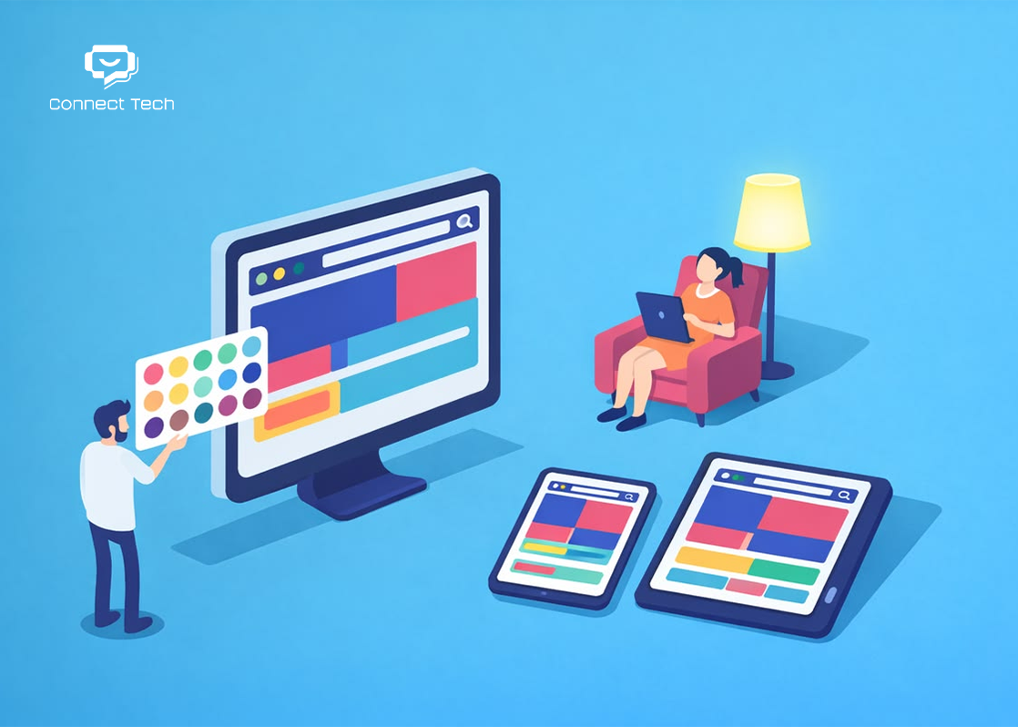
Colors shown on design screens can differ significantly from real-world usage. Brightness, contrast, and ambient light all affect how users feel.
Failing to test on mobile, tablet, and different types of screens introduces unnecessary risk into the experience. Website colors that work on desktop do not automatically work in real usage contexts.
Mistakes in choosing website colors are not about selecting “bad” colors. They are about choosing colors without strategy. For a deeper look at current context, an article on website design color trends can help clarify how brands have been using color to guide user emotion and behavior in recent years.
V. Conclusion
Website color is not a minor detail. It determines whether customers trust you, make a purchase, or come back. The first 90 seconds shape the entire perception. Color accounts for up to 85% of that decision. You may have the best product and the strongest content. But if the colors are wrong, customers leave before they read a single line.
If your current website shows familiar symptoms such as a high bounce rate, users scrolling quickly without converting, or an overall feeling of “nothing is wrong, but nothing convinces either,” there is a strong chance that website color is the bottleneck.
Connect Tech understands how color actually works
We do not design websites “to look nice.” We design for conversion. Every project starts with in-depth analysis:
- Who your target customers really are
- What they need to feel in order to trust
- Which colors trigger purchase behavior
- What competitors are doing to create differentiation
Contact Connect Tech today to receive a free consultation on website color strategies tailored to your industry. Do not let the wrong colors destroy your business opportunities. One correct decision about website color can completely transform revenue.
Related Article:
Table of Contents
Related news
Does a Website Need a Redesign After 6 Months?
Does a website need to be redesigned after 6 months? Discover the signs that indicate it's time to upgrade your website, improve SEO performance, enhance user experience, and increase business results.

The Risks of Not Owning Your Website Source Code: What Every Business Should Know
What are the risks of not owning your website source code? Learn how it affects ownership, maintenance, SEO, and long-term growth, and discover how Connect Tech helps protect your digital assets.
Website Speed Optimization Checklist: 10 Essential Items Every Business Should Review Regularly
Discover a 10-point website speed optimization checklist to improve performance, enhance user experience, boost SEO rankings, and increase conversion rates with Connect Tech.

How to Make Your Website Fast and Stable: 8 Solutions Every Business Should Apply
How can you make your website fast and stable? Discover practical solutions to optimize website speed, improve performance, and ensure long-term reliability with Connect Tech.

Website Speed: How Much Does It Impact Your Revenue?
How does website speed affect your business revenue? Learn how page load speed influences user experience, SEO, conversion rates, and discover effective optimization solutions with Connect Tech.

Technical Issues That Prevent a Website from Ranking on Google
Is your website failing to rank despite investing in content? Discover the 10 most common technical SEO issues that affect Google rankings and learn how Connect Tech can help you fix them.