Loading Table of Contents...
Color Trends in Website Design for 2025
Discover the 2025 color trends in professional website design. Stay updated with trending palettes to enhance user experience and optimize your online brand.
Colors play a pivotal role in website design. If the structure and functionality of a website are its backbone, colors are the outer layer that makes it captivating, conveys powerful messages, and sparks emotions and user interaction.
A well-chosen color palette communicates your brand identity, targets your audience, and leaves a lasting impression of your products or services. With this in mind, Connect Tech invites you to explore the dominant color trends for website design in 2025 and learn how to select and apply them strategically to create standout, engaging, and user-friendly websites.
I. Key Color Trends in Website Design for 2025
1. Bold and Vibrant Tones
Bold tones like cobalt blue, vivid orange, and neon purple are making a strong comeback in 2025. This shift is not random.
As users scroll quickly, especially on mobile devices, strong colors help capture attention within the first few seconds. That initial impression often determines whether a user stays or leaves.
This color style works best for:
- Startups and tech brands
- Youth-oriented products
- Campaigns that need to stand out
However, bold colors should be used strategically. Overusing them can overwhelm users and reduce readability.
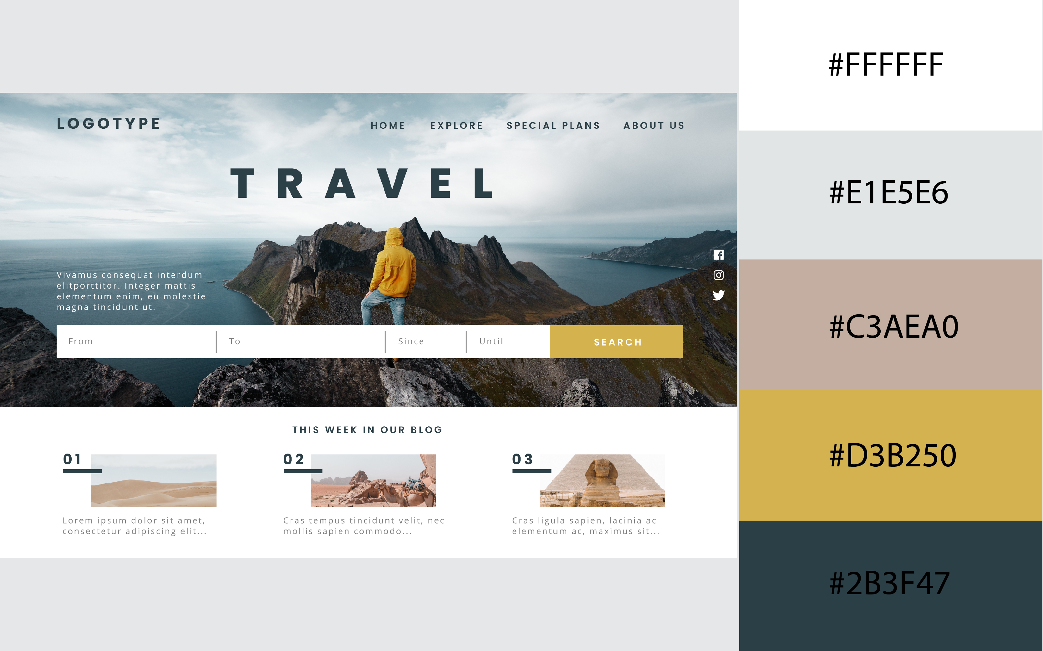
2. Monochrome Trend
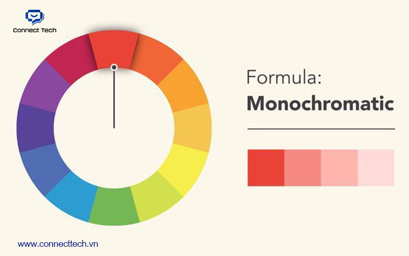
Monochrome continues to be a popular choice thanks to its simplicity and strong brand consistency. Instead of using multiple colors, this approach focuses on one primary color and its different shades.
Why it works:
- Creates a clean and professional look
- Strengthens brand recognition
- Reduces visual noise, helping users focus on content
Monochrome is especially suitable for:
- Fashion brands
- Premium services
- Portfolio or creative websites
When executed well, a single color palette can still feel sophisticated and distinctive.
3. Flexible Gradient Transitions

Gradients are not new, but their application in 2025 is more refined and intentional.
Instead of overly vibrant and complex blends, modern gradients tend to be:
- Softer
- More natural in transition
- Used selectively rather than across the entire interface
Why gradients remain effective:
- Add depth and a modern feel
- Highlight key elements like call-to-action buttons
- Prevent layouts from looking flat or monotonous
They work well for:
- Tech products
- Digital platforms
- Brands that want to convey creativity and innovation
4. Warm Neutral Tones
Neutral shades such as beige, brown, cream, and warm gray are becoming a reliable choice across many industries.
This trend reflects a growing preference for experiences that feel:
- Trustworthy
- Comfortable
- Approachable
Especially as users become more sensitive to visual overload, softer palettes help create a more pleasant browsing experience.
Neutral tones are ideal for:
- Interior and architecture
- Beauty and skincare
- E-commerce
- Brands focused on sustainability
When combined with strong imagery and typography, neutral palettes can still feel engaging without being overpowering.
II. How to Choose the Right Color Palette for Your Brand
1. Align with Brand Personality
For a youthful, rebellious, and bold brand image, vibrant neon colors are a perfect fit. Financial, legal, or educational services aiming to convey trust and stability should prioritize neutral or cool tones like blue, gray, or brown. Fashion or art websites align well with monochrome or gradient trends.
2. Analyze Your Target Audience
Understand the age, gender, location, and preferences of your website visitors. Younger audiences gravitate toward bold, striking, and personalized colors. In contrast, middle-aged or premium service clients prefer neutral, elegant, and user-friendly tones.

3. Ensure Contrast and Accessibility
Regardless of your color choices, ensure sufficient contrast so content, buttons, and information stand out against the background. A user-friendly website prioritizes accessibility; colors alone aren’t enough. Use tools like WebAIM Contrast Checker to verify contrast levels, ensuring all visitors can comfortably engage with content without eye strain.
III. Integrating Color Trends into All-Inclusive Website Design Services

Many websites struggle with color choices made based on personal preference or by copying competitors. The result may look visually acceptable but lacks distinction and fails to support conversions. At Connect Tech, color is not chosen by intuition. It is defined based on business goals and user behavior.
1. Strategy-Driven Color Selection
Before design begins, the team clarizes:
- Website objectives
- Target audience
- Desired user actions
From there, the color palette is built to align with the brand while supporting conversion goals.
2. Applying Color to User Experience
Color is used intentionally to:
- Highlight call-to-action elements
- Guide user attention
- Improve readability and content clarity
This ensures the website is not only visually appealing but also easy to use and effective.
3. Testing and Optimization
All color elements are validated for:
- Contrast and accessibility
- Mobile visibility
- CTA performance
In some cases, multiple color variations are tested to identify the most effective option.
A visually appealing color palette may capture attention in the first few seconds. However, a well-structured color system is what keeps users engaged and drives action.
That is how Connect Tech approaches website design. Not by applying trends in isolation, but by integrating color into a broader strategy focused on user experience and business performance.
Related Article:
Table of Contents
Related news
Does a Website Need a Redesign After 6 Months?
Does a website need to be redesigned after 6 months? Discover the signs that indicate it's time to upgrade your website, improve SEO performance, enhance user experience, and increase business results.
The Risks of Not Owning Your Website Source Code: What Every Business Should Know
What are the risks of not owning your website source code? Learn how it affects ownership, maintenance, SEO, and long-term growth, and discover how Connect Tech helps protect your digital assets.
Website Speed Optimization Checklist: 10 Essential Items Every Business Should Review Regularly
Discover a 10-point website speed optimization checklist to improve performance, enhance user experience, boost SEO rankings, and increase conversion rates with Connect Tech.

How to Make Your Website Fast and Stable: 8 Solutions Every Business Should Apply
How can you make your website fast and stable? Discover practical solutions to optimize website speed, improve performance, and ensure long-term reliability with Connect Tech.
Website Speed: How Much Does It Impact Your Revenue?
How does website speed affect your business revenue? Learn how page load speed influences user experience, SEO, conversion rates, and discover effective optimization solutions with Connect Tech.
Technical Issues That Prevent a Website from Ranking on Google
Is your website failing to rank despite investing in content? Discover the 10 most common technical SEO issues that affect Google rankings and learn how Connect Tech can help you fix them.