Loading Table of Contents...
Standard website banner sizes for every screen
Learn standard website banner sizes for every device, plus safe zone rules, image optimization tips, and a technical SEO checklist.
Website banner size directly affects both visual experience and page loading speed. A sharp image that fits properly across different devices helps businesses communicate their message clearly and improve conversion performance. This article provides standard dimensions, safe zone rules, and a technical checklist to help you build a professional platform and optimize business performance.
What is a website banner and where is it commonly placed?
A website banner is a static or animated visual used to communicate a brand message to visitors. Businesses use banners as important visual touchpoints to attract attention, introduce new products, and guide user behavior throughout the browsing journey.
On a standard interface, developers usually place banners in five main positions based on the customer journey. Each position requires a different format and web banner size to maintain balance across the overall page structure.
- A hero banner appears at the top of the homepage and usually occupies the largest area to create a strong first impression.
- A sidebar banner appears in the side column of the interface and provides supporting information or displays promotions alongside the reading flow.
- An in-post banner is placed naturally between content sections to maintain user engagement while visitors are exploring detailed information.
- A popup banner automatically appears in the center of the screen and is commonly used for urgent announcements or lead collection through a preconfigured form.
- A footer banner appears at the bottom of the webpage and summarizes the message while presenting a final call to action before visitors leave the page.

Standard website banner sizes
Interface designers often follow a consistent set of dimensions to maintain layout stability. The table below summarizes some of the most commonly used standard dimensions across e-commerce platforms and corporate websites.
|
|
|
|
|
|
|
|
|
|
|
|
|
|
|
|
|
|
|
|
|
|
|
|
Why should you use standard website banner sizes?
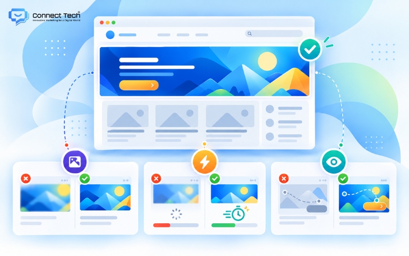
Using standard banner dimensions in web design helps maintain the visual quality of the interface. Images remain sharp, avoid pixelation, and preserve their proportions when users switch between desktop and mobile devices. A polished visual presentation directly strengthens brand credibility, especially among B2B customers.
In addition, using standard dimensions helps the server optimize page loading performance. The browser does not need to spend additional resources recalculating proportions or automatically resizing images during loading. Faster response times reduce the risk of visitors leaving because they have to wait too long for content to appear.
Furthermore, standard website banner dimensions can strongly support revenue growth strategies based on eye-tracking principles. A well-structured layout keeps core messages and call-to-action buttons within the user’s natural field of vision. This makes it easier for customers to understand the value proposition and complete a conversion compared with a cluttered interface.
Safe zone rules to prevent banners from being cropped on mobile
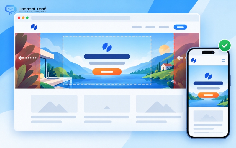
A safe zone is the central area of an image that can remain fully visible across different devices without being cropped. When a website uses responsive technology, the system may automatically crop the left and right edges of a hero banner on smartphone screens to maintain the required frame height. If designers place text too close to the outer edges, mobile users may not be able to read important content.
The key principle is therefore to place all conversion-focused content within the central area of the design. Whether customers use an ultrawide desktop monitor or a narrow vertical smartphone screen, the system should still communicate the business message clearly and completely. The logo, brand message, and call-to-action buttons are the most important elements to keep inside the safe zone.
You should also pay close attention to font size and color contrast on mobile interfaces. Text inside the safe zone needs to be large enough and clearly separated from the background image to maintain a smooth user experience. Customers should not have to strain their eyes or zoom in with their fingers just to read a short service message.
SEO checklist for optimizing banner images before upload
Google evaluates website quality based partly on page performance and how effectively image data can be interpreted, including factors related to Core Web Vitals. Website administrators should carefully review technical requirements to protect SEO performance. The table below summarizes the key criteria to check before uploading banner images.
|
|
|
|
|
|
|
|
|
|
|
|
|
|
|
|
|
|
|
|
|
|
|
|
Frequently asked questions about website banner size
The questions below address some of the most common concerns related to banner implementation and performance optimization on digital platforms.
Is website banner size the same as social media banner size?
No. These two types of dimensions are different. Closed platforms such as Facebook or Zalo usually require fixed aspect ratios such as square 1:1 or horizontal 16:9. Independent websites, in contrast, allow administrators to customize much wider horizontal images or narrow vertical formats.
Should you use a static image or an animated GIF for a hero banner?
You should generally prioritize static images to optimize website performance. Static images offer faster loading speeds and can maintain high visual quality, supporting a more professional brand presentation. Animated GIFs should mainly be used for short-term promotional messages because their larger file sizes can place additional load on the server.
How can you keep a large banner sharp without slowing down the website?
You should combine lossless image compression with lazy loading. Specialized tools can reduce the file size as much as possible while preserving the original color range. Lazy loading then ensures that the browser only loads the image when the user actually scrolls to its position.
User experience and website performance depend heavily on following proper image design standards. Optimizing website banner size should not be treated as an isolated image-editing task. It should be integrated into a broader interface strategy that supports the customer’s search behavior and purchasing journey.
If you are looking for a partner to build an SEO-friendly website that is optimized for conversions and easy to scale in the future, contact Connect Tech to receive the most suitable technology solution.
Connect Tech provides custom website design solutions that combine technology, SEO, and Digital Marketing so websites can grow alongside the business. Contact Connect Tech for advice on a solution that matches your business model and objectives.
Connect Tech - Web Design Agency
Innovative Marketing for a Digital World
Hotline: 077 317 5996
Email: info@connecttech.vn
Table of Contents
Related news

What is visual design? A foundation for better conversions
What is visual design? Learn the role of a visual designer and design and visualization fundamentals for better UX/UI and website conversions.
Standard website banner sizes for every screen
Learn standard website banner sizes for every device, plus safe zone rules, image optimization tips, and a technical SEO checklist.
Website header: Design standards for better UX and SEO
What is a website header? Explore its structure, standard dimensions, and design examples that improve UX, conversions, and customer retention.

What is a website footer? Structure and standard examples
What is a website footer? Learn its role and design principles, plus beautiful website footer UI examples and templates for better user experience.

Top 15 web design fonts for SEO and better UX/UI
Explore the best web design fonts for 2026. Learn how to choose commonly used fonts that improve UX/UI and support Vietnamese characters correctly.

What is a wireframe? Wireframe vs mockup explained
What is a wireframe? Learn the difference between wireframes and mockups and why structural sketches help businesses improve user experience.